Brief an AI model to draft buttons, error messages and empty states that tell users exactly what happened and what to do next, then review them in context.
Why AI struggles with microcopy
Microcopy is the short text inside an interface: button labels, form hints, error messages, confirmation dialogs and the message a user sees when a list is empty. Each piece is only a few words, which makes it look like an easy job for AI. In practice it is one of the harder ones, because the meaning of those few words depends on things the model cannot see.
A model asked for "an error message for a failed upload" does not know whether the file was too large, the wrong type or blocked by a network problem. It does not know what the button next to the message says, or what the product calls things elsewhere. So it writes something safe and general, such as "Oops, something went wrong. Please try again." That sentence is friendly and useless: it does not say what happened or what to change.
The fix is not a cleverer prompt. It is giving the model the same context a UX writer would have from looking at the screen, plus rules that are specific to each kind of element.
Give the model the screen, not just the string
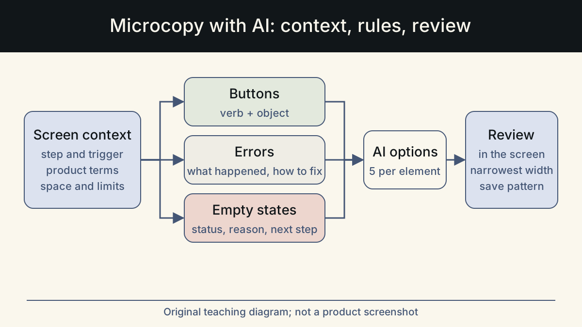
Before you ask for any text, write a short context block. Keep it the same for every request about that screen, and paste it at the top. These are the items that change the answer most often:
- Screen and step: where the user is, and what they were trying to do. "Upload step of the invoice import, after choosing a file."
- Trigger: the exact condition that shows this text. "File is over 10 MB" is a different message from "File is a PDF, not CSV".
- What the user can do next: the actions available on the screen right now, with their current labels.
- Product terms: the words your product already uses. If the rest of the app says "workspace", the model must not write "project".
- Space: the character limit or the width of the component. Ask for options that fit, and say whether text can wrap.
- Voice rules: three or four rules from your style guide. For example, sentence case, no exclamation marks, no humor in errors.
- Facts to use: real limits and values, such as the maximum file size. Ask the model to leave a bracketed placeholder for any value you have not confirmed.
Error messages: what happened and how to fix it
Nielsen Norman Group's error-message guidelines ask for plain, jargon-free language, a precise description of the problem, a constructive remedy and a tone that does not blame the user. The GOV.UK Design System adds practical wording rules. Say what went wrong and how to fix it. Avoid words such as "invalid" and "valid" that add nothing, avoid harsh or legalistic terms, and skip humor such as "oops". It also recommends keeping whatever the user has already entered.
Turn those rules into instructions the model can follow. Give one trigger per request. Ask for the message in two parts: the problem in plain words, then the action that fixes it. Ban generic messages such as "An error occurred" and "This field is required". For empty fields, the GOV.UK pattern is a direct instruction that matches the field label, such as "Enter your email address".
The example below shows a typical first output and the version after the rules were applied. It is illustrative, written for this article.
Empty states: status, reason and the next step
An empty state is what users see when there is nothing to show: no projects yet, no search results, no notifications. Nielsen Norman Group's guidance on empty states warns against leaving the space blank, because users cannot tell whether the system is loading, broken or genuinely empty. It recommends saying clearly that there is nothing to show, using the space to teach what the feature does, and giving a direct path to the main task.
That gives you a three-part instruction for the model. First line: the status, in plain words. Second line: why it is empty or what will appear here. Then one button that starts the most likely task. Ask for different versions for different causes. A first-time empty state ("You have not created any reports yet") needs a different message from a filtered one ("No reports match these filters"). The filtered one should also offer a way to clear the filters.
Watch for one AI habit in particular: filling empty states with cheerful filler such as "Nothing to see here yet!" or "It's quiet in here". It reads as friendly in a demo and as noise the hundredth time.
Review in the real screen, then make it a pattern
Microcopy that reads well in a list of options can fail on the screen. Paste the chosen text into the design or a staging build before you approve it. Check it at the narrowest width you support, next to the other labels on that screen.
Use this checklist for each piece:
- Says what happened or what will happen, in words the user would use.
- Error messages state the fix. Buttons start with a verb and name the object.
- Uses the product's existing terms, with no new synonyms.
- Every number and limit matches the real system. No placeholders left.
- Fits the component without truncation at the narrowest supported width.
- Makes sense when read alone, for example by a screen reader user who jumps between buttons.
- No blame, no jokes in errors, no "please" or "sorry" used as padding.
Keep a library of approved patterns
Once a pattern is approved, save it with its trigger and context. The next time someone asks the model for a file-size error, they paste the approved pattern as an example and get consistent text across the product. This library also becomes the voice sample you include in future requests.
Whalory is one way to keep this setup in one place. It is a writing workspace for professionals who write with AI. It offers task-specific forms and workflows for roles including UX writers, plus brand voice settings and a review step that keeps approved facts and removes invented claims. The examples in this article are illustrative, not customer results.
Sources
- Error-Message Guidelines (Nielsen Norman Group)
Plain language, precise problem description, constructive remedies, no blame, and preserving user input.
Checked: November 10, 2026
- Error message component (GOV.UK Design System)
Wording rules: say what went wrong and how to fix it, words to avoid such as invalid, oops and please, and instruction patterns for empty fields.
Checked: November 10, 2026
- Designing Empty States in Complex Applications (Nielsen Norman Group)
Do not leave empty states blank; show status, teach the feature and give direct paths to key tasks.
Checked: November 10, 2026
- OK-Cancel or Cancel-OK? (Nielsen Norman Group)
Follow platform conventions for button order, and name buttons for what they do rather than using a generic label.
Checked: November 10, 2026
This article was written and reviewed with AI assistance. The sources above are there for you to check. Weigh the advice against your own situation.
Try this method on your own writing
Spotted a mistake or something unclear? Report it on GitHub. The article name and the section are enough; do not put confidential details in a public report.